My Custom Cards. (Simpsons Project Framed)
Posted: Tue Apr 27, 2010 5:52 pm
Ok I enjoyed how zipbags has the layouts and custom cards framed and ect. I know many people do custom cards on here so I thought I'd get some opinions on which of these you like the best that I've done.
The 3 below are sample cards from the show Dexter, Movie Kick-Ass, and TV Show Glee. All 3 are really different in a lot of ways. Each sheet is a 9x12 then I cut them into 6 seperate cards and ect.
As you can see the Dexter ones are really simple. Just a picture of them from the show, then a touch of Blood Splatter to give it a little bit of a Dexter feel.
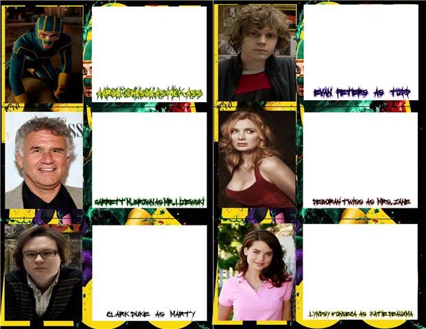
The Kick-Ass ones what I did was put the movie poster as the background, then added the picture and a place to sign. I also decided to fool around with the name area alittle bit. Hard to read online but it's much better in person.
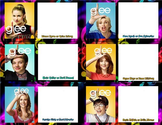
The last one is of the cast of Glee. I did this one for a friend who is a huge fan and is getting into Autographs. I used a black background with colorful music notes to tie it into the show, since all the pics I used were the bright colored backgrounds.
So of those 3 which do you like the best? Thanks in advance for any info, good or bad.

The 3 below are sample cards from the show Dexter, Movie Kick-Ass, and TV Show Glee. All 3 are really different in a lot of ways. Each sheet is a 9x12 then I cut them into 6 seperate cards and ect.
As you can see the Dexter ones are really simple. Just a picture of them from the show, then a touch of Blood Splatter to give it a little bit of a Dexter feel.
The Kick-Ass ones what I did was put the movie poster as the background, then added the picture and a place to sign. I also decided to fool around with the name area alittle bit. Hard to read online but it's much better in person.
The last one is of the cast of Glee. I did this one for a friend who is a huge fan and is getting into Autographs. I used a black background with colorful music notes to tie it into the show, since all the pics I used were the bright colored backgrounds.
So of those 3 which do you like the best? Thanks in advance for any info, good or bad.